Frequency Trails: Introduction
Frequency trails are a simple and intuitive visualization of the distribution of sampled data. I developed them to study the finer details of hundreds of measured latency distributions from production servers, and in particular, to study distribution modes and latency outliers.
Latency outliers are occurrences of unusually high latency, and can be a source of performance problems. The plot on the right shows disk I/O frequency trails from one hundred servers, spanning the 0 to 20 ms range (x-axis). Larger ranges can be plotted to include and study more of the outliers, which I'll show in a moment.
I'll start by explaining the problem these address, and use other visualizations for comparison. I'll then provide example frequency trails based on the same data, and explain how they work.
This is the first part in a series on frequency trails. For the other parts, see the main page or the navigation panel on the left.
Problem
The following is a histogram of disk I/O latency from a production server, from 10,000 I/O:

The presence of outliers has pushed the majority of data to a few bars on the left, reducing visible detail. The infrequency of the outliers makes them hard to see. One way to address these problems is to use a density plot, which shows estimated probability based on the sample set, and a rug plot:

The density plot shows more detail for the majority of data, and the rug plot (the vertical lines) show where the outliers are.
Frequency Trail
Now, the frequency trail for the same data (without labels):

When the frequency trail is near-zero in height, only individual data points are drawn. Compared to the earlier density plot, I find this more intuitive: if data wasn't present, the line isn't drawn. This is also a compact way to show a distribution, and can be rendered inline (like this: ![]() ).
).
With inverted colors:

And filled:

This can highlight the majority of data when extreme outliers are present.
At Scale
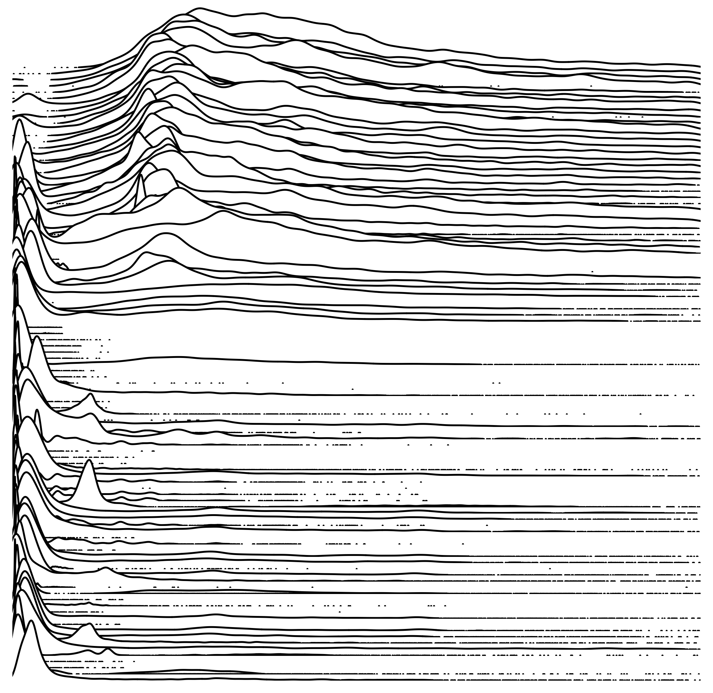
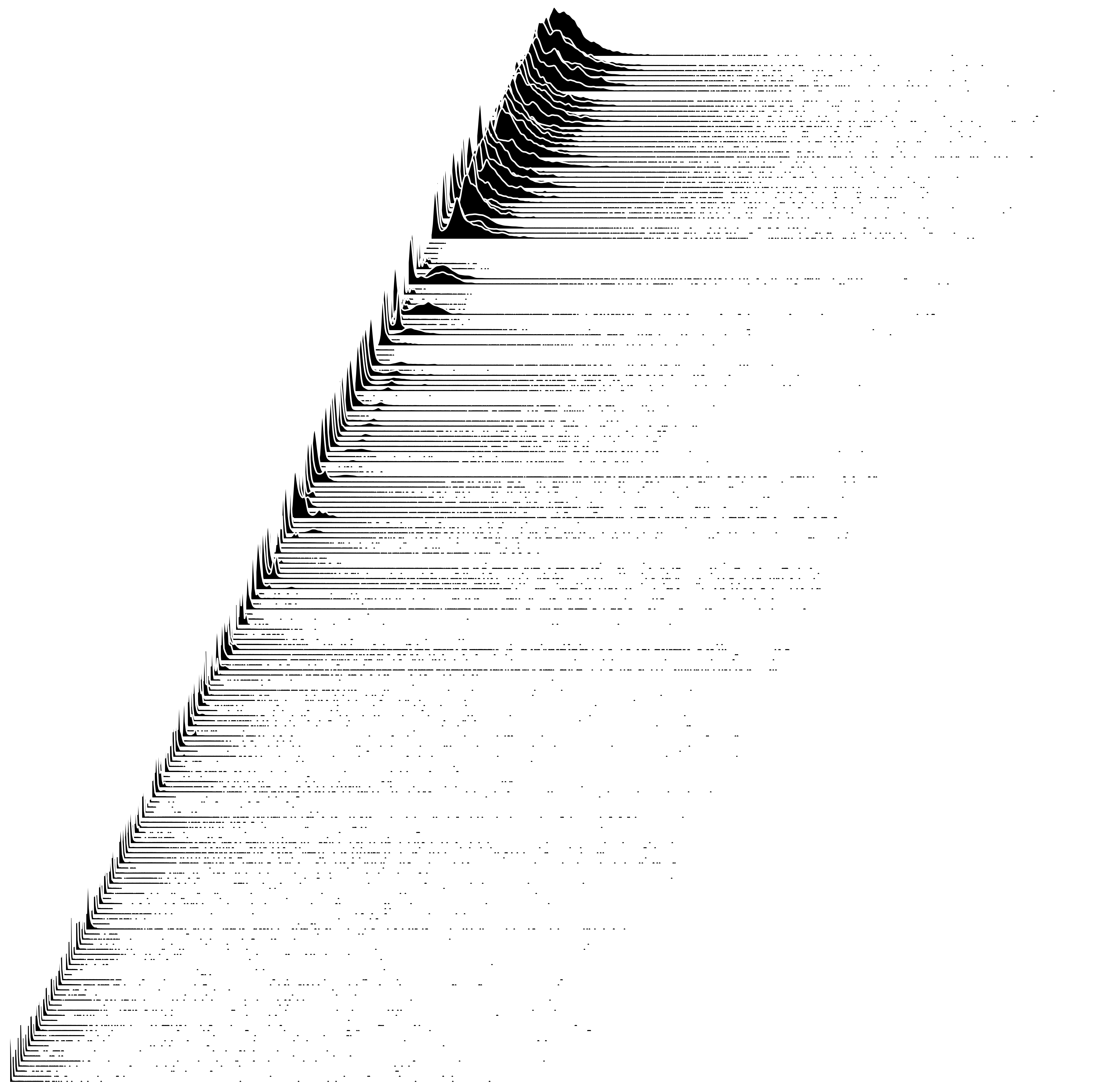
The following disk I/O distributions are from 200 production servers, each showing 10,000 I/O, and with the range 0 to 100 ms. On the left is a montage of histograms with rug plots, and on the right is a staggered overlapping plot of frequency trails (like a waterfall plot). Click for larger versions.
 |
 |
The frequency trails show more detail, and each distribution can be more easily compared to others. Some details can also be seen to be missing: I was expecting some patterns among the outliers, but in this case they look random.
The filled version of the frequency trail was used here, and a black border added to differentiate overlapping plots. Here is white background version. The ordering of distributions from top to bottom has been sorted to smooth the overall visualization. In this case, it's sorted on CoV.
For some more detail on those modes, here is the 0 - 20 ms range for the first 100 servers (and without the fill this time):

This was shown in white earlier. The wider mountains near the top, from roughly 5 to 12 ms, show a high frequency of I/O with rotational disk latency. The bottom of the plot shows more distributions with latency on the far left, near 0 ms, corresponding to disk cache hits. Some of the distributions are bimodal, with frequent cache hits and misses.
Explanation
The frequency trails seen here are constructed from two plot types:
- density plot: these are used when data samples are frequent, using a small bandwidth to provide high resolution. Imagine a histogram with narrow bars, and tracing the top with a smooth line. This provides enough detail to understand the shape of the distribution modes.
- rug plot: this is a one-dimensional plot used when the data samples are infrequent and sparsely located, and highlights the location of outliers.
Other plot types can be used for a similar result. The goal is to provide the best resolution view of the data samples: their frequency, as is shown coarsely by histograms.

The example on the right shows how it visualizes different distribution types. This is from a synthetic library I had developed for testing. There is also a filled version.
To generate these I used R, and tried different methods for generating frequency trails. The simplest is to generate a high resolution kernel density estimate for the distribution (say, with 2048 points), and then to replace frequencies below a minimum threshold with "NA". When plotted as a line graph, R skips the NA values, eliding the near-zero line. An example in R is here.
For the images here, I used a different technique which combines density plots and rug plots. The density plots represent the frequency with a smooth line, and the rug plots show the outliers with the highest resolution possible (and I can adjust the line width to be very thin). A loop walks the density estimates array for the distribution, while maintaining a state machine of line vs rug, and plots a line or rug when the state changes based on a threshold of low density. If someone would like to develop a CRAN library for this or the simpler implementation, that would be great.
I generated the waterfall plots using ImageMagick and multiple transparent layers, to work around some issues I had with R and density plot polygons (I'll try again to do this in pure R).
These can be used to study any distribution type, especially those that include outliers. I've been studying latency of up to one thousand distributions at a time. These are read from trace files, which contain timing for each individual I/O, and which get large quickly: the input for the 200 server plot was over 100 Mbytes of trace data (generated using a DTrace script; on Linux, I'd use perf_events or my perf-tools). My ad hoc R/ImageMagick/shell/awk process of generating the final image took over ten minutes of processing time.
For production use, such as in performance monitors, latency heat maps are more practical.
vs Heat Maps
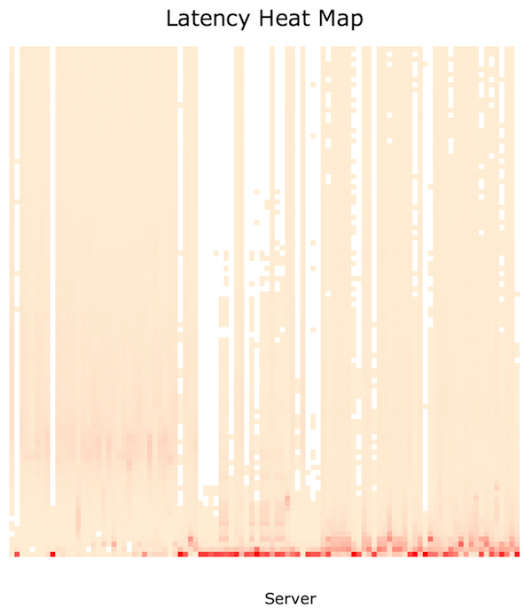
Here are frequency trails and a heat map of the same data set. For an explanation of how latency heat maps work, see Visualizing System Latency.
|
 |
Click the heat map for an interactive svg. Each column shows an individual server, rather than the passage of time. The columns are also sorted, like the waterfall plot, to smooth details from left to right.
I created this heat map using trace2heatmap.pl, described here. At first the heat map looked like this – with much of the detail washed out. This is because the color range is scaled based on the highest bucket (block) in the entire heat map. I switched it to scale color, for each column (server), based on the highest bucket in that column alone. Now the detail was revealed.
In this case, the heat map is doing a reasonable job of showing both mode and outlier data. For comparison with the earlier frequency trail, here is the 0 - 100 ms heatmap, where mode details are a little harder to see, and outlier details are beginning to be lost.
Frequency trails use height to show the frequency of data rather than color, and provide higher resolution for outliers. Subtle details can be more easily seen by small variations in height, rather than small variations in color saturation. Being line graph-based may also make it more familiar and understandable than heat maps, which require you to comprehend color saturation as a dimension.
The waterfall plots provide another difference: unusually located modes are emphasized, as their peaks overlap other frequency trails.
The overheads of gathering the data and generating frequency trail plots may make it challenging to provide them in a real-time performance monitoring product. However, it should be possible to provide a lower resolution version similar to how heat maps are provided today: quantized during collection, then resampled as needed. This should make micro frequency trails possible (![]() ) which could be included along with server details (like how sparklines are used).
) which could be included along with server details (like how sparklines are used).
Inspiration
Style is inspired by Edward Tufte: conveying data by hiding the line, presenting all the data in one visualization without chart junk, and high definition graphics in text. And the inverted colors looked good in an iconic plot of a pulsar.
For more frequency trails, see the main page. For the next part in this series, see outliers.