Utilization Heat Maps
Device utilization is a key metric for performance analysis and capacity planning. On this page I'll illustrate different ways to visualize device utilization across multiple devices, and how that utilization is changing over time.
As a system to study, I'll examine a production cloud environment that contains over 5,000 virtual CPUs (over 600 physical processors). I'll show how well different visualizations work for an environment of this scale, including:

- Command Line Interface Tools
- Tabulated Data
- Highlighted Data
- 3D Surface Plot
- Animated Data
- Instantaneous Values
- Bar Graphs
- Vector Graphs
- Line Graphs
- Ternary Plots
- Quantized Heat Maps
I originally published this as http://dtrace.org/blogs/brendan/2011/12/18/visualizing-device-utilization.
Definition
Device utilization can be defined as the time a device was busy processing work during an interval, so a device at 100% utilization is active doing work 100% of the time. Such a device may not accept more work, becoming a system bottleneck. Or it may accept more work but do so with higher latency, causing poor performance.
While utilization may be an imperfect metric, depending how it is defined and measured (I listed some reasons on page 75 of Solaris Performance and Tools), it's still tremendously useful for quickly identifying (or eliminating) devices as sources of performance issues.
Problem Statement
For any given device type (CPUs, disks, network interfaces), and any number of devices (from a single device to a cloud of servers), we'd like to identify the following:
- single or multiple devices at 100% utilization
- average, minimum and maximum device utilization
- device utilization balance (tight or loose distribution)
- time-based characteristics
By including the time domain, we can identify whether utilization is steady or changing, and various finer details. These may include short bursts of high utilization, where it is useful to know the length of the bursts and the interval between them. Longer patterns over time may also be observed, such as how load changes during a 24 hour or weekly cycle. Time-based patterns may also be compared to other metrics, and correlations observed that illuminate complex system interactions. This may all be possible by studying how utilization varies across a time-series (the examples below use 60 x 1 second values).
Finally, we'd like to observe this all in realtime.
1. Command Line Interface
Device utilization is usually available via command line tools. These may show per-device utilization numerically, with interval summaries printed in realtime. If the output scrolls, changes over time can be identified by reading and comparing previous summaries.
These tools usually don't handle scale. I'll illustrate this for CPU utilization.
One Server, 1 second
CPU utilization on Unix/Linux systems can be examined with the mpstat(1) tool. It prints a single line of output for each virtual CPU, with various useful metrics (the columns vary on different systems):

This one second summary shows 16 virtual CPUs. CPU 1 is at 100% utilization (calculated by inverting the last column, %idle), which can be evidence of a software scaleability issue (single hot thread).
One Server, 60 seconds
We'd also like to see how this changes over time. This is 60 x 1 second summaries from mpstat(1):

For a sense of scale, I've highlighted the 1 second summary shown earlier.
This amount of output is already difficult to digest. On a terminal, this would be many pages to scroll through. And this is just one server.
Data Center, 60 seconds
This data center has over 300 servers. Showing 60 seconds across all of them:

This gives an impression of the amount of data involved, in terms of mpstat(1) output. The output is so small that the whitespace between rows and columns creates an effect that appears like fabric.
The rectangle represents the amount of data that a single server contributes. Each server's data in this image is actually placed in a horizontal line. One such line is darker than the others, in the middle top. The darkness was caused by high multi-digit values in many of the mpstat(1) columns, replacing whitespace with numbers (this prompted me to investigate further on the server; the issue turned out to be a misconfigured sendmail calling 3000 exec()s per second, which caused high values for the minf, xcal, migr, smtx and sysctl columns).
2. Tabulated Data
I'll now visualize just the per-CPU utilization values, per-second, as a table of values. This strips the mpstat(1) output down to just the (inverted) %idl column, which provides a better sense of the volume of the utilization data we are trying to understand.
One Server, 60 seconds
16 CPUs and 60 x 1 second summaries of utilization only:

Unlike the mpstat(1) server summary, this time the font size is (almost) large enough to read. In a few places a single CPU hits 100% utilization, visible as an unbroken line of digits (100100100).
Data Center, 60 seconds
Over 50 servers:

This image is more interesting than I would have guessed (click for high-res). Faint darker patterns are caused by areas with double- and triple-digit (100%) utilizations, where the digits themselves give a darkness effect. This differs from the mpstat(1) dark patterns, as these highlight utilization only.
3. Highlighted Data
Utilization values could be highlighted deliberately by coloring the background relative to the value.
One Server, 60 seconds


Distinct patterns now emerge. While there are bursts of CPU load across many CPUs, only CPU 0 seems to be busy the entire time (perhaps mapped as a device interrupt CPU).
This visualization can be thought of as having three dimensions, as pictured on the right, with the third the utilization value represented as color saturation. (I'm using the HSV definition of saturation.)
Data Center, 60 seconds
Over 300 servers:

This time it's not necessary to highlight a single server - some busier servers are clearly visible as red rectangles. Other observations:
- Servers with a single hot thread appear as
 or
or  , depending on how well the thread stays on one CPU (affinity) or skips around.
 - Some servers like
 and
and  have multiple hot CPUs, but also idle CPUs, which may be a sign that load is not balanced (either due to thread scalability or CPU resource caps).
 - Most servers show consistent CPU load over time, with only a few like
 showing high variance (that is the same one as was shown in the previous One Server example).
 - Idle servers
 can clearly be seen, which often contain one or two short bursts of single CPU usage (monitoring software). The entire image is speckled with these short bursts.
Also apparent is that most servers in this data center are idle at this time of day (off peak).
Limitations
The server images answer some of the tricker questions from the problem statement: they can identify single and multiple hot devices, unbalanced utilization, and, as a bonus: utilization that shifts between devices (![]() ). They aren't good at expressing exact utilization values, which rely on how well our eyes can differentiate color. Average utilization across devices is also hard to determine.
). They aren't good at expressing exact utilization values, which rely on how well our eyes can differentiate color. Average utilization across devices is also hard to determine.
The data center image provides a great impression across all 332 servers. Were this to be used as a tool, the numbers could be dropped (the highlighting is sufficient) and it could be made interactive: mouse over servers for expanded details. However, scaling this much further will be difficult. This example has little more than 1 pixel per data element. If each server had 64 virtual CPUs instead of 16, the number of elements would increase by a factor of 4.
While these images look similar to heat maps (covered later), they aren't the same. One reason is that heat maps (usually) have scalar dimensions. Within the server images, the x-axis is scalar (time), but the y-axis is the set of CPU IDs - which may have no relative meaning (operating systems can enumerate their virtual CPUs in odd ways). On the data center image, the x- and y-axes span repeated ranges. Servers that are nearby on the image are also nearby physically, just due to the way the data was collected, but this is in no way a reliable scalar dimension.
One Server, 1 hour
This is the same server example from before, but for a full hour:

Each horizontal strip represents 8 minutes. I've included this just to show what could happen when scaling time. What's interesting about this image isn't the CPU utilization, but the lack of CPU utilization - idle time - shown as white patches.
4. 3D Surface Plot

Three-dimensional plots can be created from the dimensions: CPU ID, time and utilization. Given that two of the dimensions are provided in the data set as regular steps, CPU ID and time, a surface plot may be suitable as these map to regular latitude and longitude points. The utilization value becomes surface elevation.
One problem may already be expected, as shown on the right. The utilization value can change steeply from one point to the next, making the surface difficult to follow. This can be improved by reducing the elevation of the utilization dimension.
One Server, 60 seconds
16 CPUs, 60 x 1 second averages:

Time is the x-axis from left to right, CPU ID is the y-axis, and the z-axis (elevation) is the utilization value. This has also been colorized based on the utilization value, so, utilization is represented here by both elevation and color saturation.
An issue when scaling this plot type is that the grid lines (polygon edges) for this wireframe visualization can become too dense, resulting in a black surface. They can be removed:

Data Center, 60 seconds
Over 300 servers:

This is similar to the visualization from the Highlighted Data section (the server ordering is aligned differently). Click for high res.
Zooming in:
Now returning the grid lines:

This line width creates an extra effect highlighting subtle changes in elevation (click for full version). If the lines are too fine, the visualization approaches the previous version; if the lines are too thick, it appears black.
5. Animated Data
Over 300 servers, over time:

The utilization data for each second is shown by one frame, which consists of just the 5,312 CPUs as highlighted pixels (similar to before, but the digits were dropped). This animation has been sped up to 10x normal time, and shows 20 seconds in a loop (click for the full 60 seconds).
The advantages are similar to those in the Highlighted Data example above. Some additional disadvantages are that it cannot be included in printed text, and that identifying time-based patterns relies on memory and patience. Memory, to identify differences between a sequence of frames, and patience, to consume information at the rate of the animation. This may become irritating - if one frame out of a six-second loop is interesting, it's difficult to study if it's only visible once every loop. Additional controls could be added to slow or pause the animation.
6. Instantaneous Values
A highlighted table of current utilization values is a simple visualization that answers some questions, without the density of including historic data. Here is current utilization across 5,312 CPUs:

This is actually a single frame in the previous animation. Here, the utilization digits have returned (click for high-res). Servers appear as vertical columns, and there are two rows of servers.

Microsoft Windows 8 will include this type of visualization in the Task Manager, to show instantaneous utilization values on systems with more than 64 virtual CPUs (logical processors). The screenshot on the right is from an MSDN blog post that explains the move. This shows 113 CPUs, and has a scrollbar to reveal more.
I switched the screenshot from blue to red to fit better with the other visuals (click for the original). I also think red better suggests hot CPUs.
While this doesn't include historic data, it's worth including for consideration. Now that it will be in Windows, this type of visualization for device utilization may become widely understood. Also note that Microsoft call these "heat maps". I'll show a different type of heat map in the Quantized Heat Map section.
7. Bar Graphs
Bar graphs can be used to show a single utilization value, which scales the length of the bar. Mac OS X has Activity Montior, which can provide a "Floating CPU Window" bar graph that can be placed anywhere on the screen. An example is pictured here, from a laptop with two CPU cores, and has a bar graph for each. (Click to see the green original.)
The advantage is that utilization can be understood at a glance, instead of reading utilization digits or examining color. This visualization could also be enhanced by placing watermarks at the recent minimum and maximum values.
Using a bar graph for each device will become difficult when scaling to 5,320 CPUs, at which scale a bar graph may be better suited for just the average utilization across all devices.
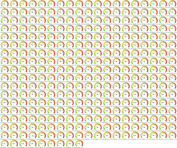
8. Vector Graphs
Angle can be used as a visualization device. In the example below, a gauge similar to a car tachometer shows server CPU utilization (average for all CPUs). This is from a commercial monitoring product intended for cloud and other environments.

As with bar graphs, this only shows a single utilization value. Other values may be indicated around the edge: this example has a green to red spectrum. I'm not sure what this coloring means in the context of CPU utilization. At the very least, it shows which end of the range is which. It could also just be decorative, which along with the whitespace around the round shape makes this visualization type one of the least dense, which may be a problem for scaling.
To see how this could scale to a cloud environment, I've created a couple of montages from this example image. Here are 322 servers and 5,352 CPUs, both 600 pixels wide. Both images include a single CPU at 60% utilization and another at 100% (find them?).
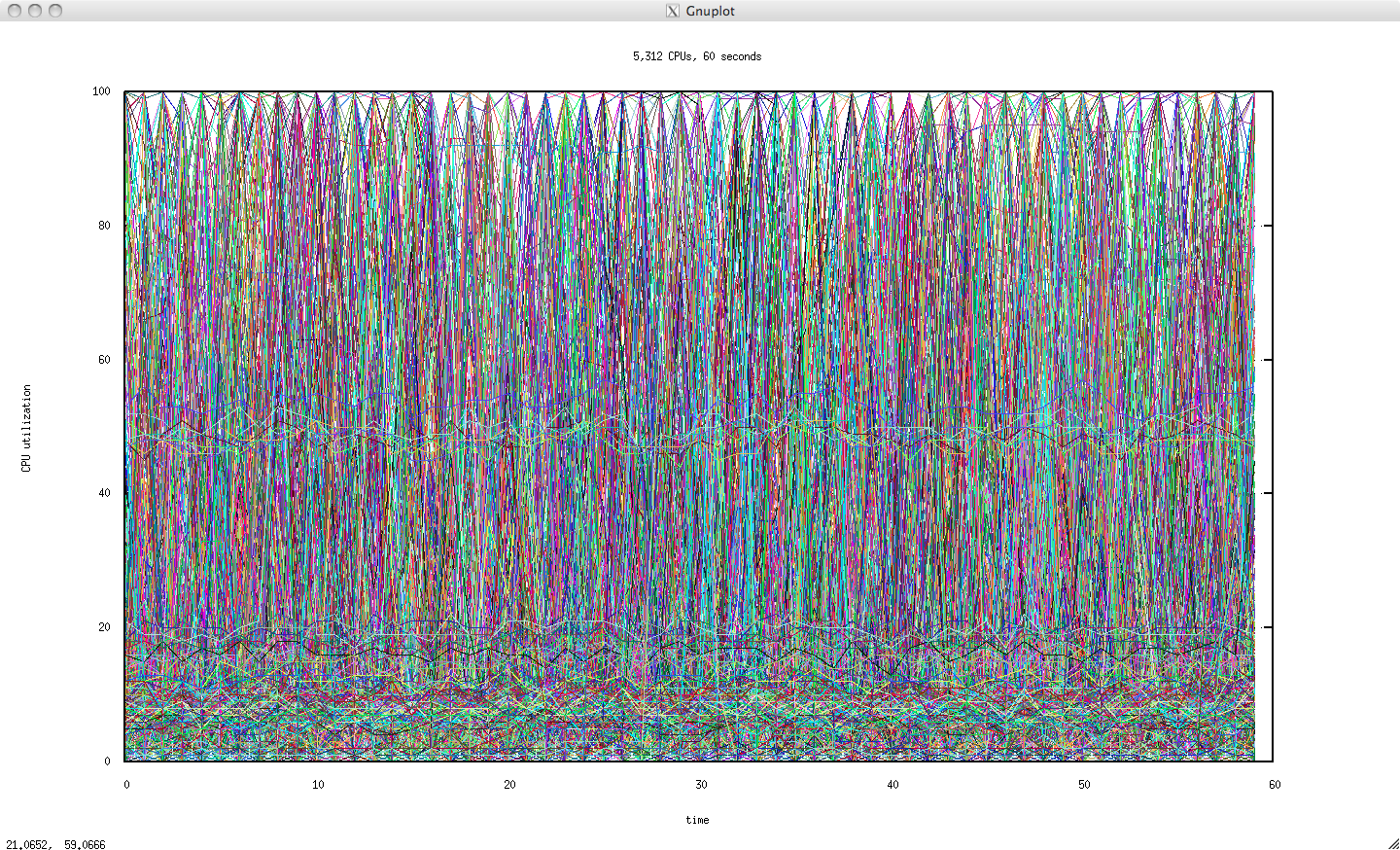
9. Line Graphs
Showing time on the x-axis allows the passing of time to be visualized intuitively from left to right. The level of utilization, shown on the y-axis, can be understood at a glance, and can be compared quickly and accurately from one second to the next. Such a comparison is difficult with color, and requires reading for digits.
One Server, 60 seconds
16 CPUs, with each drawn as a separate line:

This is the same server as previously visualized separately (shown above as ![]() ). Single CPUs hitting 100% can be clearly seen, although the lines from multiple CPUs remaining at 100% overlap.
). Single CPUs hitting 100% can be clearly seen, although the lines from multiple CPUs remaining at 100% overlap.
For comparison, here is a busier server (previously visualized as ![]() ):
):

CPU utilization is loosely grouped around 50%, with a CPU hitting 100% every eight seconds. Also noticeable is that there is no longer a flat bottom edge of idle CPUs, showing that usually all CPUs are doing work.
A server that is mostly idle (previously visualized as ![]() ) looks like this:
) looks like this:

Activity with two periods can be seen: a large spike in single-CPU utilization every 30 seconds, and a smaller burst every eight seconds.
Data Center, 60 seconds
Scaling this to 5,312 CPUs:

This visualization hasn't really worked (using the full range of random colors doesn't help either). The pattern of horizontal lines at about 20% utilization is only visible because those CPUs were drawn last, on top of the previous lines (you can see them at the bottom of data center visualization in the Highlighted Data section). If the CPU ordering is shuffled when drawn, those lines vanish.
Average, One Server
Taking the first server from before, and showing just the average utilization across all CPUs:

This works well. The average - and how it changes over time - is often used for capacity planning.
Averages hide the presence of devices at 100% utilization. For this 16 CPU system, each CPU only contributes 1/16th to the average. Even if a CPU were to change from 0% to 100% utilized, the line only moves by 6.25%. This is much smaller and harder to see across multiple systems.
Adding a maximum line can show the hottest device:

While this works, in practice we'd often like to know how many devices were hot. Disks under the ZFS filesystem, for example, will often hit 100% for periods of seconds during transaction group flushes - which is perfectly normal. One or two disks at 100% utilization, however, is not normal (and can be from a particularly difficult pathology with unreported drive failure that I've seen many times). So, I'd like to know more than just knowing something hit 100% -- how many? And were other devices close to 100%, or not?
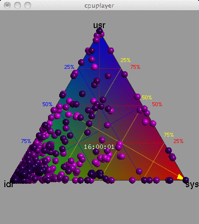
10. Ternary Plots
The barycentric coordinate system can be used to create a ternary plot ("Barry3") showing three components of CPU utilization: user, system and idle. User-time is time spent in application code, and system-time is time spent in the kernel: processing system calls, interrupt routines and asynchronous kernel threads. These breakdowns of CPU utilization are commonly used by Unix and Linux operating systems, and are useful for a better understanding of the CPU workload. The mpstat(1) tool prints them out by default (%usr, %sys, %idl).
Data Center, 15 seconds

The Barry3 plot on the right includes 5,312 CPUs, and is also animated with a frame for each second. Just the first 15 seconds have been included here to keep the GIF small.
The advantage of this visualization is that any one of the three dimensions can be picked, and then all points considered based on that dimension (the plot can be rotated to aid this). Also, all three dimensions can be read directly from each point. Another potential advantage is that patterns between user and system CPU time could be identified (they could also be identified from an x-y plot of %usr and %sys). Other device types that can breakdown utilization into three components could also be visualized using the Barry3.
This was created using the cpuplayer tool, and an awk program to reprocess the previously collected mpstat(1) data. I modified cpuplayer to handle the high CPU count, and made some cosmetic changes to simplify the look (original here, which includes grid-lines to aid reading each dimension).
Limitations
One issue with the Barry3 visualization is that CPUs can overlap, especially at the corners, making it difficult to know how many CPUs were in that state. This is made worse by the data set I'm using, which has integer values for utilization (due to a limitation of mpstat(1), not the underlying operating system statistics, which in this case are high resolution CPU microstates). There are also issues with making this an animation (memory and patience), as was discussed previously.
The triangle shape leaves much room unused in the top corners, which may become more noticeable if multiple ternary plots were drawn (instead of the animation). Note that a rectangular x-y plot of %usr and %sys would have a similar degree of unused space for the triangular area where %usr + %sys was greater than 100.
11. Quantized Heat Maps
Finally, the device utilization heat map (aka "heatmap") uses a column quantization to visualize utilization in three dimensions: time (x-axis), percent utilization (y-axis), and number of CPUs (z-axis, color saturation) within the time/latency range. This is perhaps the most useful visualization that I've created to date. Bryan Cantrill first developed it into Sun Storage Analytics while we worked on the advanced products team at Sun Microsystems. I mentioned this towards the end of my ACMQ article on Visualizing Latency under the heading "Other Applications", which summarizes the concept:
Utilization of components can also be visualized as a heat map showing the percent utilization of individual components, instead of displaying an average percent utilization across all components. Utilization can be shown on the y-axis, and the number of components at that utilization can be shown by the color of the heat-map pixel. This is particularly useful for examining disk and CPU utilization, to check how load is balanced across these components. A tight grouping of darker colors shows that load is balanced evenly, and a cloud of lighter pixels shows that it isn't.
Outliers are also interesting: a single CPU at 100 percent utilization may be shown as a light line at the top of the heat map and is typically the result of a software scalability issue (single thread of execution). A single disk at 100 percent utilization is also interesting and can be the result of a disk failure. This cannot be identified using averages or maximums alone: a maximum cannot differentiate between a single disk at 100 percent utilization and multiple disks at 100 percent utilization, which can happen during a normal burst of load.
This has been developed further with the Joyent Cloud Analytics product, where it is used to analyze the performance of devices across multiple systems in the cloud. Such utilization heat maps may become a standard tool for visualizing device utilization, especially in light of CPU scaling and cloud computing environments.
Data Center, 60 seconds
Over 300 servers (5,312 CPUs):


Recapping: the x-axis is time, the y-axis is CPU utilization percent, and the z-axis (saturation) shows how many CPUs were at that time and utilization level. This is shown on the right, and is different than all previous visualizations (color no longer represents utilization; here it is used for the CPU count).
Each rectangle that makes up the heat map is a "bucket" spanning a time and utilization range, and is colored based on the CPU count (darker means more).
The darker colors at the bottom of this heat map show a constant concentration of idle CPUs. The red line at the top shows a constant presence of CPUs at 100% utilization. The dark color of the 100% line shows that multiple CPUs were at 100%, not just one. (I'll explain the exact color algorithm in the Saturation section).
Apart from identifying multiple CPUs at 100%, this shows generally that CPUs are idle, near the bottom of the plot. A subtle band can also be seen around 50%.
One Server, 60 seconds
Seeing how this looks for a single server (the same as has been selected previously), with 16 CPUs:

CPUs hitting 100% can be seen at the top of the plot. Periods when CPUs are and are not idle are also clearly visible at the bottom.
The number of quantize buckets on the y-axis is so high for only 16 CPUs that this appears as a scatter plot. Reducing the number of buckets to ten (as well as reducing the height):

Now that each quantize range is more likely to span multiple CPUs, more shades are chosen. This can help create patterns.
Other server examples follow. As these include much whitespace, a simple border has been added.
Idle Server
This is the same idle server shown as a line graph earlier (and as ![]() ):
):

Light Load
A server with light load, and a single CPU sometimes hitting 100%:

Busy Server
This busier server has a tighter distribution of CPU utilization, grouped around 50%:

Saturation
The color saturation of each bucket reflects the relative number of CPUs that were quantized in that time/utilization range. The more CPUs, the darker the color is.
The actual algorithm used here is non-linear, which helps identify subtle patterns. A linear algorithm could be used that makes the bucket with the highest CPU count the darkest shade available, and the bucket with the lowest CPU count (probably zero) the lightest, and all buckets in-between scaled linearly by those. In practice, this can wash out details as some buckets (in the case of CPU utilization, the idle buckets representing 0% utilization) would have such a high CPU count that the others only use much lighter shades - and appear washed out. An example of linear application of saturation based on value is on the right.
For the heat maps above, the buckets are first sorted from least to most CPUs, and then the full spectrum of shades applied to the sorted list. This ensures that the full spectrum of shades are used, making best use of that dimension, and allowing subtle patterns to be seen that would otherwise be washed out. This approach was devised by Bryan Cantrill for the heat maps used by the Sun Storage products. He named it rank-based coloring.
Hue and Value
The hue used above is red, merely to stay consistent with other images here. When used in the Highlighting Data section, more red meant hotter CPUs, which seems intuitive. Here, more red means a concentration of CPUs, even when the line we're looking at represents idle CPUs. This probably isn't a good choice of color, and can be easily changed (Sun Microsystems Analytics chose blue; Joyent Cloud Analytics chose orange).


The heat map could be adjusted to retain the intuitive nature of "red means hot" (100%). With the first example on the right, I've allowed only the top utilization range to be red, with the lower utilization ranges in grayscale. Beneath that is a different example, where the value of the red hue is scaled based on utilization (this may be referred to as saturation, depending on the color model used).
Another use of hue can be to reflect a fourth dimension. In Joyent Cloud Analytics, the make-up of the heat map can be investigated by highlighting components in different hues, which is collected as a fourth dimension to the data. For the data center heat map above, individual servers could be highlighted with their own hues. David Pacheco wrote Heatmap Coloring to explain this, which also provides examples of rank-based vs linear coloring.
Background
I thought of using heat maps for device utilization after being burned by performance issues during the development of the Sun Storage appliance, including:
- sloth disks: these are disks that mysteriously begin returning very, very slow I/O, over 1 second, yet do not return error counts (hard or soft). Their percent utilization as reported in the operating system (which is a percent busy) would stay at 100% for seconds at a time, while other disks (in the same RAID stripe) were idle. Sloth disks would kill performance, and I needed a way that I, the field engineers, and customers could all easily identify them. A constraint was that this couldn't just look for the max utilization: the ZFS file system often drove all disks to 100% utilization during transaction group flushes. This had to identify the presence of one or two such disks only.
- hot threads: this is usually where the software has not been designed to scale across all available CPUs, and some CPUs are idle while others are at 100% utilization. It could be as simple as a codepath that should be multi-threaded but isn't. One particular issue I ran into was the ZFS pipeline, where originally stages could only be processed by up to eight threads. A hot stage (compression) could limit ZFS performance as only eight CPUs could be used (this was since fixed).
For this type of issue, the workload can become bounded by the performance of the few busy devices, while the majority of the devices are idle. I've seen this type of problem across all device types (CPUs, disks, network interfaces, storage controllers, etc). The device utilization heat map quickly proved an excellent way to identify this type of issue, as well as show many other useful characteristics.
Summary
These visualizations have been created to illustrate different ways to observe device utilization on large scale environments.
I frequently need to analyze urgent performance issues on these environments using a variety of tools, and with varying degrees of success. Sometimes a customer has been unable to resolve a crippling issue because their visualization hides important details (the most common problem is a line graph showing average device utilization, making it impossible to identify that single or multiple devices are at 100%). I've condensed years of such pain and frustration into the problem statement at the top of this page, and then showed various visualizations that can satisfy those needs.
I'd suggest using:
- Quantized Heat Map: to identify single or multiple devices at 100% utilization, minimum and maximum device utilization, and device utilization balance, all over time (performance analysis)
- Line Graph: to observe average utilization across multiple devices over time (capacity planning)
The visualizations should be realtime, so that any change to the environment can be analyzed immediately and repaired sooner. Dave Pacheco and I showed how Joyent Cloud Analytics did this in the OSCON 2011 presentation Design and Implementation of a Real-Time Cloud Analytics Platform.
These visualizations can be interactive. For example, the user could click on the 100% devices in the quantized heat map, and be shown information to explain them further: how many devices there were and on which servers.
I'd also consider including both of the above visualizations plus text, for times when it's important to verbalize the state of performance quickly (the emergency concall). Text could include average utilization across all devices for different time intervals (previous minute, hour, day, week), and maximum utilization. The 95th or 99th percentile could also be included, to convey details about the upper distribution.
I'd love to see quantized heat maps show up in more places where currently bar graphs or line graphs are used.
Acknowledgments
Many tools were used to create the images in this post; by type:
- Command Line Interface Tools: mpstat(1) on Solaris was originally by Jeff Bonwick. I visualized the data using some shell scripting, awk(1), and Firefox with the Screengrab plugin.
- Tabulated Data: same tools as above.
- Highlighted Data: same tools as above.
- 3D Surface Plot: these were made using R with the lattice package, inspired by Dominic Kay's Visualizing Performance work.
- Animated Data: the same tools as before, with ImageMagick to assemble the animation.
- Instantaneous Values: includes a screenshot from Microsoft Windows 8.
- Bar Graphs: includes Mac OS X's Activity Monitor.
- Line Graphs: were created by gnuplot (after trying other tools that couldn't handle 5,312 lines).
- Ternary Plots: The Barry3 CPU visualization type was created by Dr Neil J. Gunther, and cpuplayer was written by Stefan Parvu.
- Quantized Heat Maps: this type for device utilization was created by myself at Sun Microsystems, while working with Bryan Cantrill who developed it in the Sun Storage ZFS appliance. It has been developed further by Dave Pacheco, Robert Mustacchi, and others on the Cloud Analytics team at Joyent.
Gimp was used for post processing images.
Style is inspired by Edward Tufte, including clearing "chart junk" from the line graphs and the use of high definition graphics in text (the micro heat maps, like ![]() ). From Tufte, I'd recommend reading "Visual Explanations", "Beautiful Evidence", "Envisioning Information" and "The Visual Display of Quantitative Information"; and from William S Cleveland, "The Elements of Graphing Data" and "Visualizing Data" (from which I'm tempted to reassemble this blog post to categorize visualizations into univariate, bivariate and multivariate types).
). From Tufte, I'd recommend reading "Visual Explanations", "Beautiful Evidence", "Envisioning Information" and "The Visual Display of Quantitative Information"; and from William S Cleveland, "The Elements of Graphing Data" and "Visualizing Data" (from which I'm tempted to reassemble this blog post to categorize visualizations into univariate, bivariate and multivariate types).
Thanks to Deirdré Straughan for editing this page, and for suggestions to improve the content; and to all the people (particularly Jason Hoffman) who have been referring me to books, articles and links to read about visualizations.
For more heat maps, see the main page.