Yesterday I posted about flame graphs for file systems, showing how they can visualize where disk space is consumed. Many people have responded, citing other tools and visualizations they prefer: du, ncdu, treemaps, and the sunburst layout. Since there's so much interest in this subject, I've visualized the same files here (the source for linux 4.9.-rc5) in different ways for comparison.
Flame Graphs
Using FlameGraph (SVG):
While you can mouse-over and click to zoom, at first glance the long labeled rectangles tell the big picture, by comparing their lengths and looking at the longest first:

The drivers directory looks like it's over 50%, with drivers/net about 15% of the total. Many small rectangles are too thin to label, and, they also matter less overall. You can imagine printing the flame graph on paper, or including a screen shot in a slide deck, and it will still convey many high level details in not much space. Here's an example someone just posted to twitter.
Tree Map
Using GrandPerspective (on OSX):
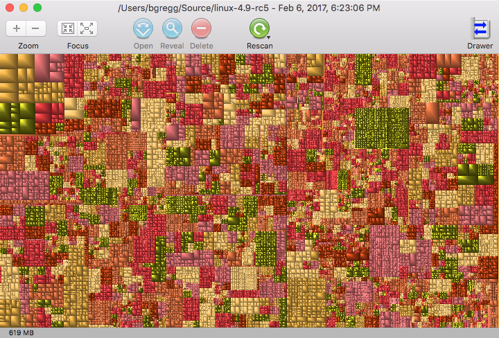
What can you tell on first glance? Not those big picture details (drivers 50%, etc). You can mouse over tree map boxes to get more details, which this screenshot doesn't convey. It is, however, easier to see that there are a handful of large files with those boxes in the top left, which are under drivers/gpu/drm/amd.
Using Baobab on Linux:
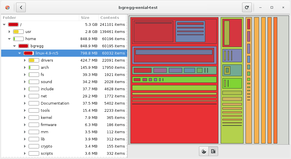
You can see that the drivers directory is large from the tree list on the left, which includes mini bar graphs for a visual line length comparison (good). You can't see into subdirectories without clicking to expand.
Here I've highlighted the drivers/net box. What percentage is that of total from first glance? It's a little bit more difficult to compare sizes than lengths (compare to earlier).
This is also missing labels, when compared to the flame graph, although other tree maps like SpaceMonger do have them. An advantage to all tree maps is that we can more easily use vertical space.
Sunburst
Using Baobab on Linux:
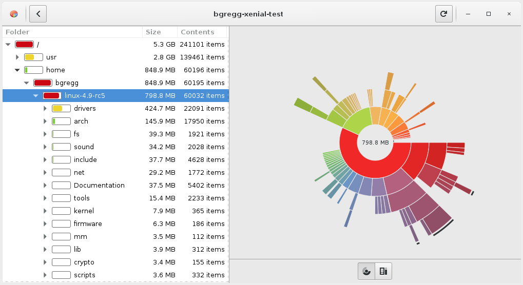
This is a flame graph (which is an adjacency diagram with an inverted icicle layout), using polar coordinates. It is very pretty, and as someone said "it always wows". Sunbursts are the new pie chart.
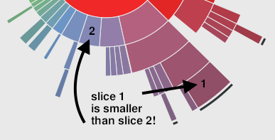
Deeper slices exaggerate their size, and look visually larger. The smaller-looking slice 2 in this image represents 27.7 Mbytes, whereas the larger-looking slice 1 is 25.6 Mbytes. This visualization is actually showing that slice 1 is smaller than slice 2, although I bet most people would think it was the other way around! The problem is that to understand this correctly requires the comparison of angles, instead of lengths or areas, which has been evaluated as a more difficult perceptive task.
ncdu
--- /home/bgregg/linux-4.9-rc5 -----------------------------------------------
                         /..
  405.1 MiB [##########] /drivers
  139.1 MiB [###       ] /arch
   37.5 MiB [          ] /fs
   36.0 MiB [          ] /include
   35.8 MiB [          ] /Documentation
   32.6 MiB [          ] /sound
   27.8 MiB [          ] /net
   14.7 MiB [          ] /tools
    7.5 MiB [          ] /kernel
    6.0 MiB [          ] /firmware
    3.7 MiB [          ] /lib
    3.4 MiB [          ] /scripts
    3.3 MiB [          ] /mm
    3.2 MiB [          ] /crypto
    2.4 MiB [          ] /security
    1.1 MiB [          ] /block
  968.0 KiB [          ] /samples
[...]
This does have ASCII bar charts for line length comparisons, but it's only showing one directory level at a time.
du
$ du -hs * | sort -hr
406M    drivers
140M    arch
38M fs
36M include
36M Documentation
33M sound
28M net
15M tools
7.5M    kernel
6.1M    firmware
3.7M    lib
3.5M    scripts
3.4M    mm
3.2M    crypto
2.4M    security
1.2M    block
968K    samples
[...]
Requires reading. Although this is so quick it's my usual starting point.
Which to use
If you're designing a file system usage tool, which should you use? Ideally, I'd make flame graphs, tree maps, and sunbursts all available as different ways to understand the same data set. For the default view, I'd probably use the flame graph, but I'd want to check with many sample file systems to ensure it really works best with the data it's visualizing.
For more about flame graphs see my ACMQ article The Flame Graph (CACM), and for more about different visualizations see the ACMQ article A Tour through the Visualization Zoo (CACM), by Jeffrey Heer, Michael Bostock, and Vadim Ogievetsky, especially the section on Hierarchies.
Click here for Disqus comments (ad supported).