Colony Graphs
Colony graphs are a simple visualization of computer life forms. A process colony graph, or "ptree graph" for short, shows live processes and their parent and child relationships.
The following three pages introduce and then demonstrate different uses of process colony graphs:
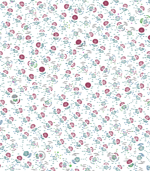
The example process colony graph on the right shows dozens of cloud server instances and their applications. Different types of servers can be identified based on their size, number of processes, color, and shape. For more about this visualization, see the cloud page, which also has the software used to generate it.
Other colony graphs (not listed here yet) can be created for other transient computer activity, including memory allocation, function execution, and storage I/O.
Summary
The colony graph visualization is a simple directed node graph, showing elements as nodes, and their relationships as arrows. The node color and size can be varied to show type and activity. Data from any number of nodes or servers can be graphed together in one image, where anomalies will stand out as they will be visually different. The choice of data – what microscopic computer life to visualize – is more interesting than the visualization itself.