Frequency Trails
Frequency trails are a simple and intuitive visualization of the distribution of sampled data. I developed them to study the finer details of latency distributions from production servers, and to identify multi-modal distributions and outliers.
The following four pages introduce and then demonstrate different uses of frequency trails:
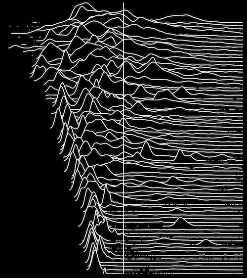
The example on the right shows a frequency trail waterfall plot, where multiple frequency trails are stacked in one image. In this example, each distribution has also been centered on its mean, with a vertical line showing the mean. For more about this visualization, see the mean page.
Summary
A frequency trail is a cross between a frequency or density plot, and a rug plot. For the bulk of the data, a frequency plot line is drawn, showing detail of the distribution mode or modes. When the data is infrequent, a rug plot is used, showing individual data points on the x-axis line. This combination provides the highest resolution visualization for both modes and outliers.
This visualization is fully introduced and explained in the Intro page.
Updates
- I first showed frequency trails on slides 20 and 22 of my Stop the Guessing talk at Velocity 2013 (PDF).
- I've put the software to generate the frequency trail waterfall plots on github, although it needs a lot of cleanup, so I can't recommend using it - but if you really want to see it, you can.
- Deirdré Straughan has put the highly sought after Unknown Measures T-shirt on cafepress, which features the mean butterfly plot seen above.