Frequency Trails: What the Mean Really Means
When analyzing response time, or latency, you need much more information than an average provides. The average, commonly the arithmetic mean, shows the index of central tendency. But, as I've found when studying latency distributions in production environments, the tendency is often not central, but may be skewed by outliers, or split by multiple modes.
I previously determined often outliers and multiple modes occurred determined quantitatively, using tests and a survey of hundreds of production servers and different types of latency. I found that over 95% had six-sigma outliers, and at least 20% had multiple modes. However, nothing beats a visualization, such as a histogram, frequency trail, scatter plot, or heat map.
In this post, I'll use a visualization to show what the mean really means.
Summary Statistic
Here's an example from the command line, from the iostat(1) tool:
$ iostat -xz 1
[...]
Device: rrqm/s wrqm/s    r/s  w/s   rsec/s wsec/s avgrq-sz avgqu-sz await svctm %util
sda       0.00   0.00 256.00 0.00 64968.00   0.00   253.78     0.46  1.80  1.05 27.00
[...]
Many are averages of some kind. Disk I/O response time, await, is particularly important, as applications may be blocked on this latency (newer versions split this into r_await and w_wait). The value 1.8 (ms) is the average during the interval, which leaves much to the imagination.
Statistics like these are also plotted as line graphs by most monitoring tools.
Guessing
Given an average of 1.8 ms, you may guess a distribution like this:

This shows a normal distribution centered on 1.8 ms. Maybe you guess a gamma distribution instead, or log-normal. Maybe you also have standard deviation, min and max, and 99th percentiles, and can guess more about the range of the distribution.
What you guess is important to consider, as, without additional information, that's all you can do: guess.
Averages
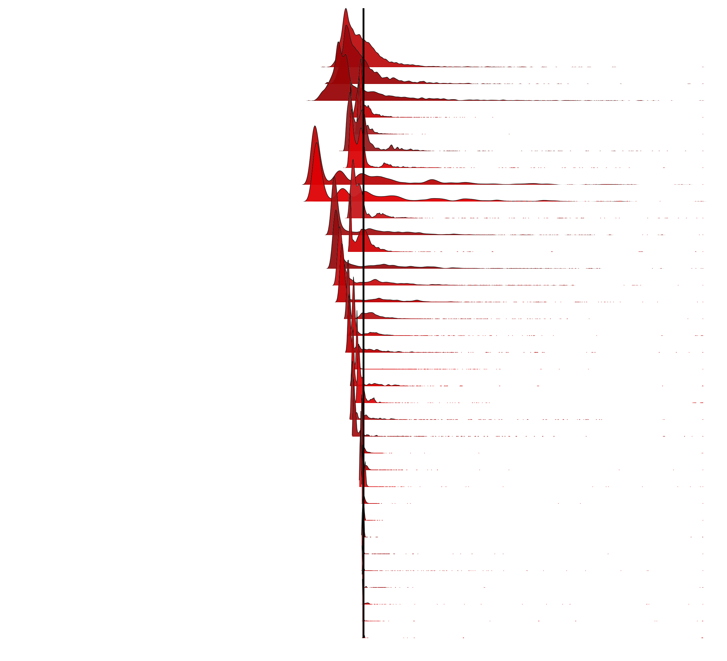
I previously studied modes, visualizing them from hundreds of production servers. Those visualizations had outliers trimmed, to focus on the bulk of the data. Here, I'll use the same distributions to investigate averages. As the outliers have been trimmed, these averages are a type of trimmed arithmetic mean, which places the mean closer to the median.
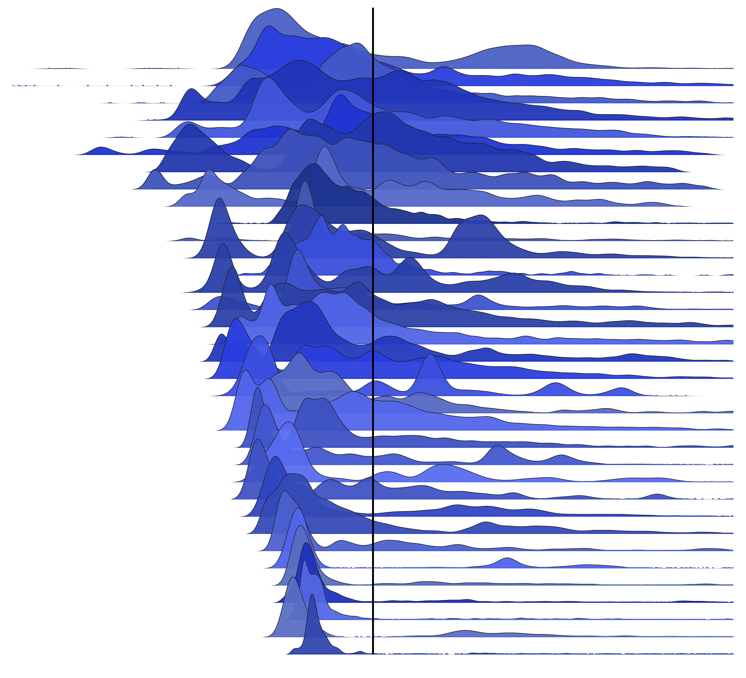
This is MySQL command latency from 35 random production servers. Axes and labels aren't included, as we are interested in the shape of the distribution and the average (arithmetic mean), indicated as a black line on each:

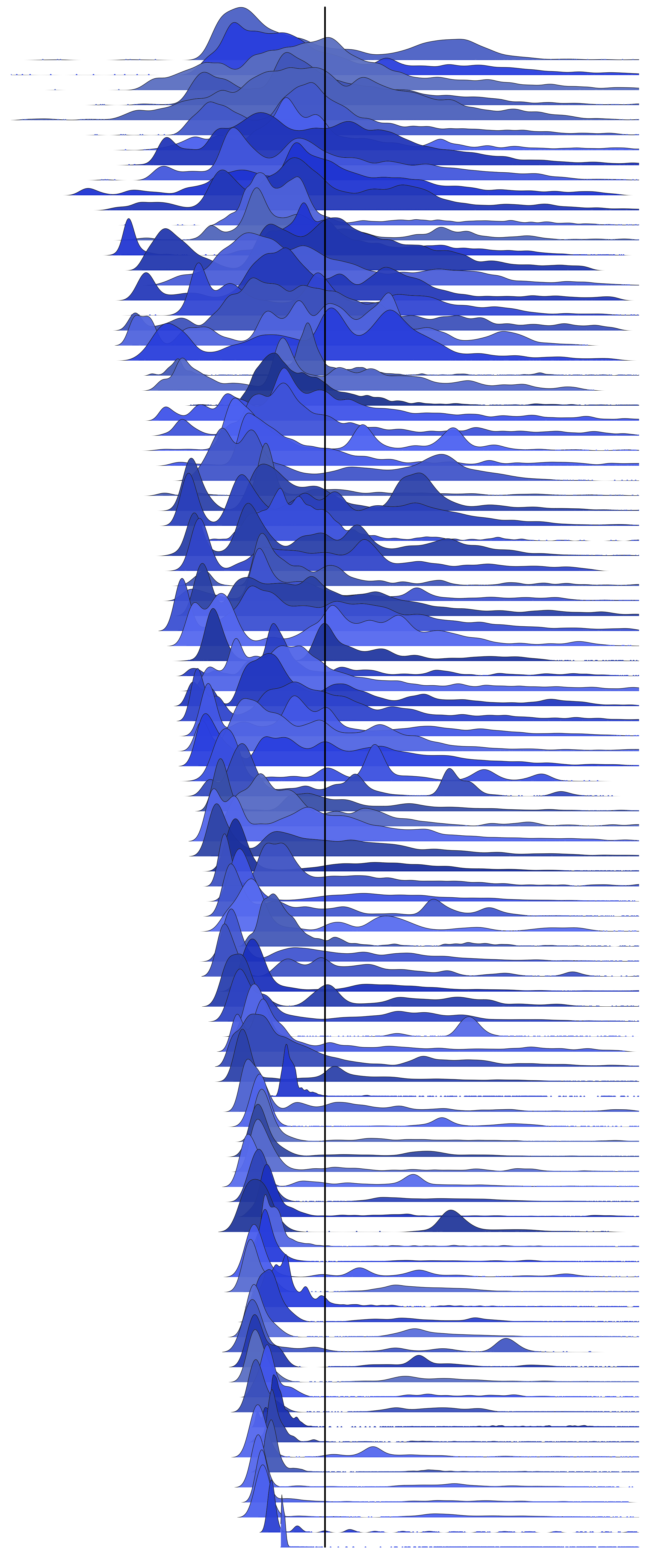
Many of the averages are not where I'd guess them to be. Here is the same for 100 servers.
These frequency trails are ordered top-down based on CoV, which locates similar shapes together.
Mean Butterfly Plot
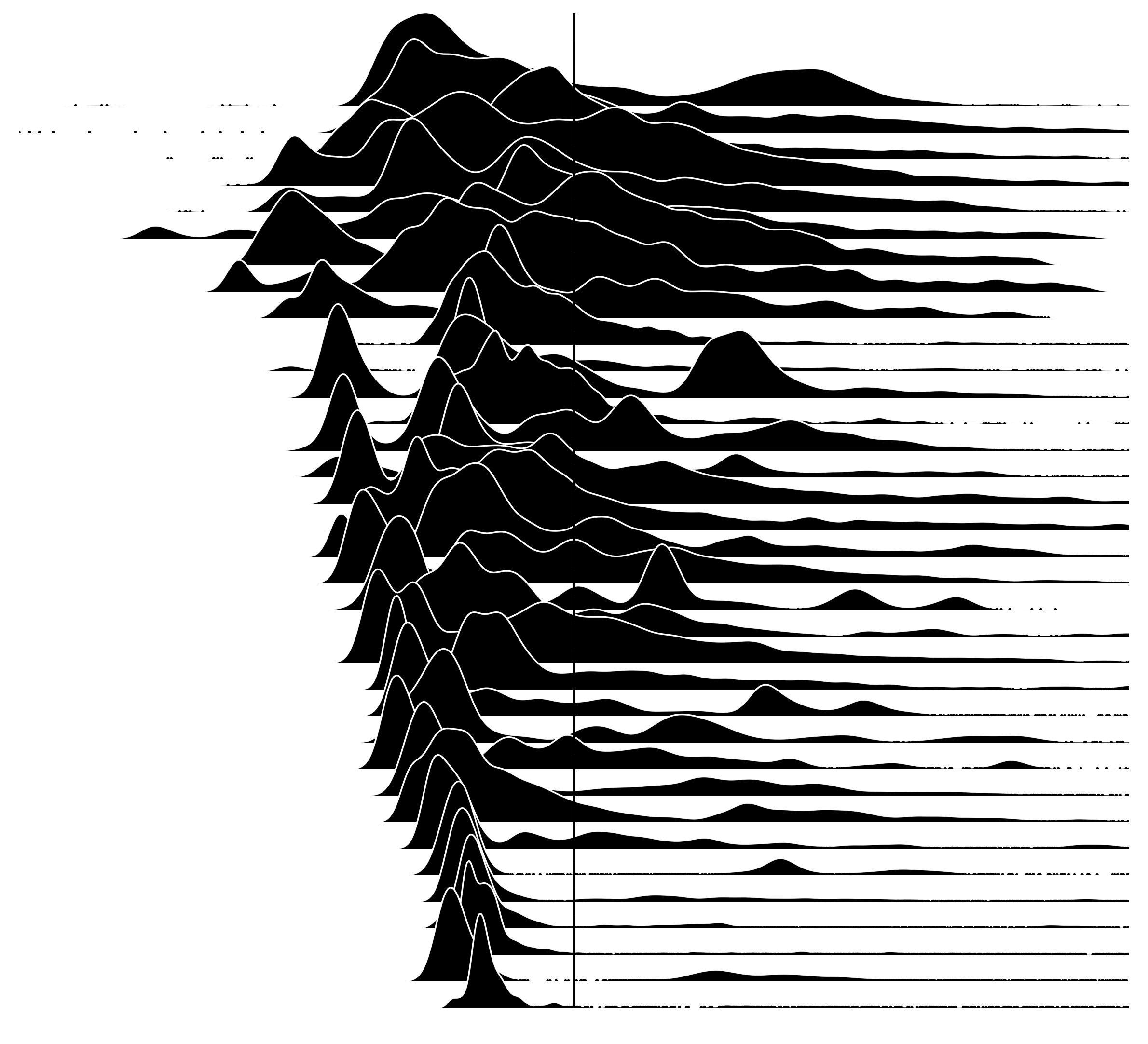
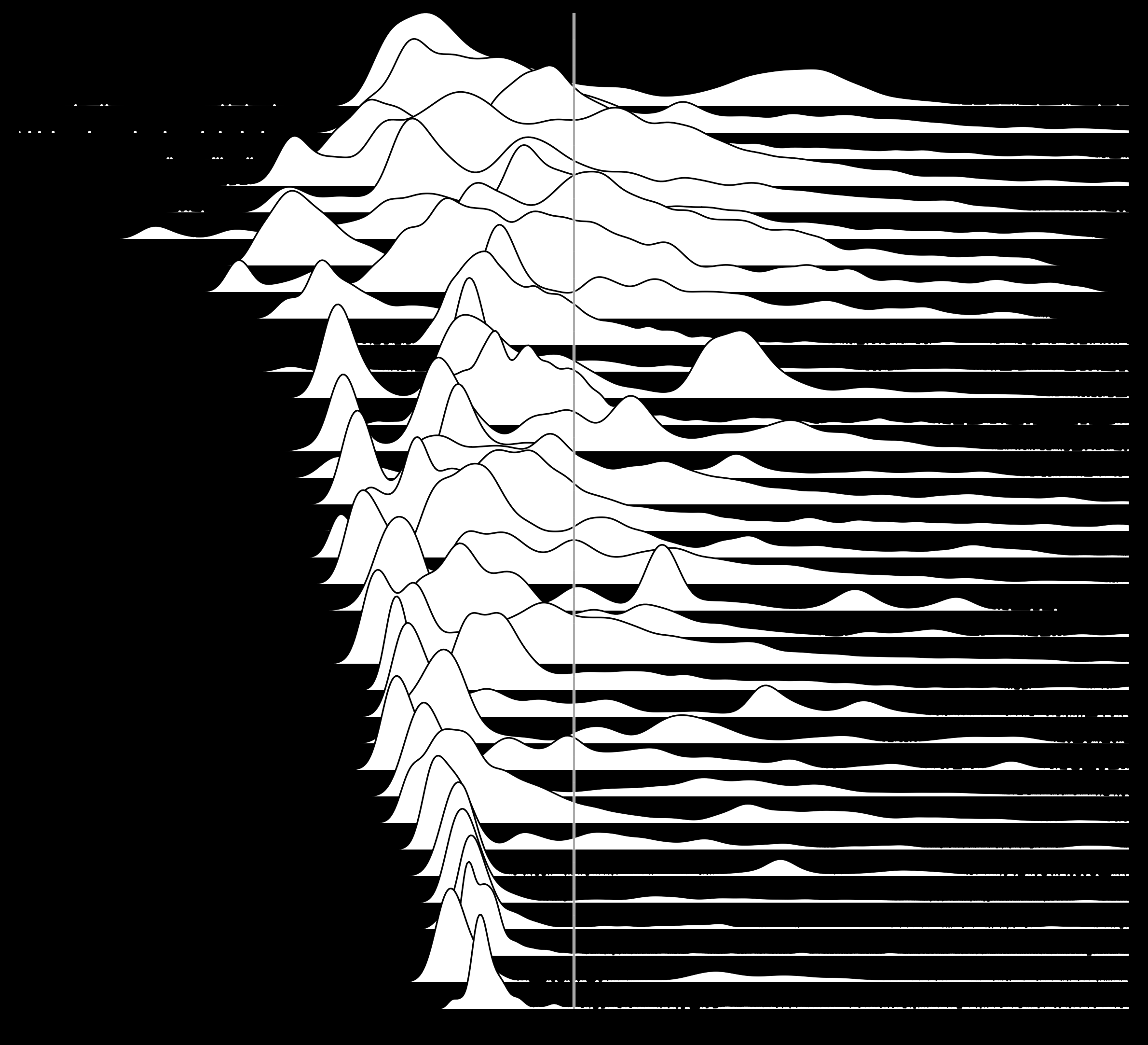
Now let's see the same 35 distributions, centered on the mean:

Also see the white and black versions, and for 100 servers (and the t-shirt design). These look so wrong, my first thoughts was that I'd made a mistake – I went diving into my R code and datasets to see what was up. The mean is pulled more to the right than I'd expect for these distributions. I did zoom a little too much, although that doesn't explain it. This image itself doesn't even look centered on this page, despite using <center> tags.
Not what you expected either? Exactly. And that's a serious problem when we only have the average to go by, or the average plus other basic statistics. Our intuition is just plain wrong.

I needed a physical representation to help my intuition understand this result. In the picture on the right, I'm balancing six Lego bricks on the left, with two Lego bricks on the right, in a shape similar to these distributions. Helpful?
This is also described in [Rice 95] when introducing the expected value of a random variable (the mean), E(X):
E(X) is also referred to as the mean of X and is often denoted by μ or μx. You may find it helpful to think of the expected value of X as the center of mass of the frequency function. Imagine placing the masses p(xi) at the points xi on a beam; the balance point of the beam is the expected value of X.
As in my picture: how can six blocks balance two? In the MySQL example latency distributions, the tail is relatively long, and doesn't need as much mass to balance the closer mode on the left.
I've rendered the bottom distribution in the previous waterfall plot as a tall histogram with wide columns to magnify detail on the right of the mean, along with column counts to help us understand why the mean appears so offset. There are 1,371 MySQL commands to the left of the mean column, and a total of 391 to the right. For this to balance, the right hand counts would need an average distance of 3.5 columns (1371 / 391), which appears to be the case.
Disk I/O
As another example, here are 35 distributions of disk I/O latency centered on the mean:

The distributions at the top look bimodal, with the average around the midpoint of the modes. These waterfall plots have the x-axis range scaled for each frequency trail. The distributions at the bottom have long tails and outliers, and a skewed average. An average alone is misleading for almost all of these distributions. (At least for the skewed averages, if the offset isn't large, it may not be a problem.)
Also see the red version (same color scheme as previous post for disk I/O), the 200 server version, and a 35 server version which is untrimmed and less centered due to the influence of outliers (but also lacks detail when extreme outliers compress the range).
Suggested Next Steps
As the distributions from these surveyed systems show, an average is not a good representation of real-world latency distributions. The best way to understand them is by visualizing them, which can be done using histograms, heat maps, density plots, or frequency trails.
As a way to identify numerically whether the average has been compromised – and the distribution needs to be visualized – you can try the six-sigma test from Detecting Outliers, and the modal test from Modes and Modality. These can identify whether outliers and multiple modes are present.
The difference between the mean and the median can be studied to detect when the mean has been offset; it may not detect bimodal distributions, where the mean and median are similar.
As a statistic, averages (including the arithmetic mean) have many practical uses. Properly understanding a distribution isn't one of them.
References, Acknowledgements
- Inspiration for the opening from @mbostock
- [Rice 95] Rice, J. Mathematical Statistics and Data Analysis, 2nd Ed., Duxbury Press
For more frequency trails, see the main page.