Hot/Cold Flame Graphs

This is an experimental visualization which combines both CPU and Off-CPU flame graphs. This shows all thread time in one graph, and allows direct comparisons between on- and off-CPU code path durations.
To illustrate the coverage, Figure 1 shows a generic thread state transition diagram, with the (hot) on-CPU state in red, and (cold) off-CPU states in blue:
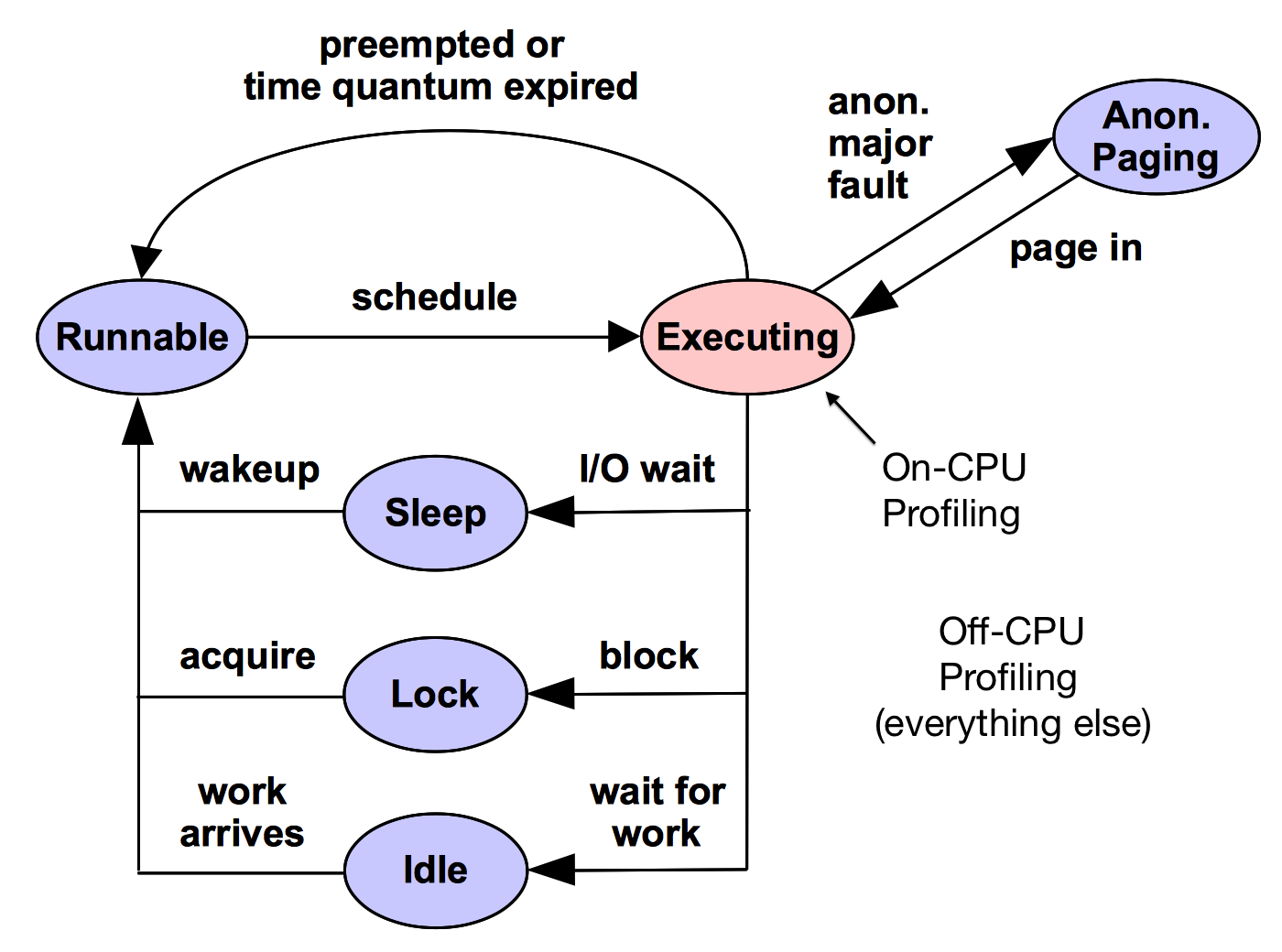
Figure 1. Thread state transition diagram.
Having one flame graph show all of these states should be incredibly useful. However, so far these hot/cold flame graphs have proved difficult to use, and this remains experimental. I've created this page to share some work in this area.
Difficulties
These include:
- Confusing off-CPU time: off-CPU time can difficult to interpret, requiring tracing of wakeup events. I've already made much progress in this area: see the page on Off-CPU Flame Graphs, and the wakeup flame graphs and chain graphs.
- Confusing off-CPU and on-CPU comparisons: summing off-CPU time from multiple threads vs on-CPU time from multiple CPUs can be a little like apple and oranges. There are a finite number of CPUs and on-CPU time to spend, and any value can be quickly interpreted as a portion of capacity. But there isn't a finite amount of off-CPU time to spend, and its interpretation depends on what the code is doing, and if it is blocking applications. This means it is interpreted differently. One way this may be addressed is to split hot/cold flame graphs into one for each thread, which does place a bound on off-CPU time: 1000ms per second. The resulting flame graph would divide thread run time into the on- and off-CPU states.
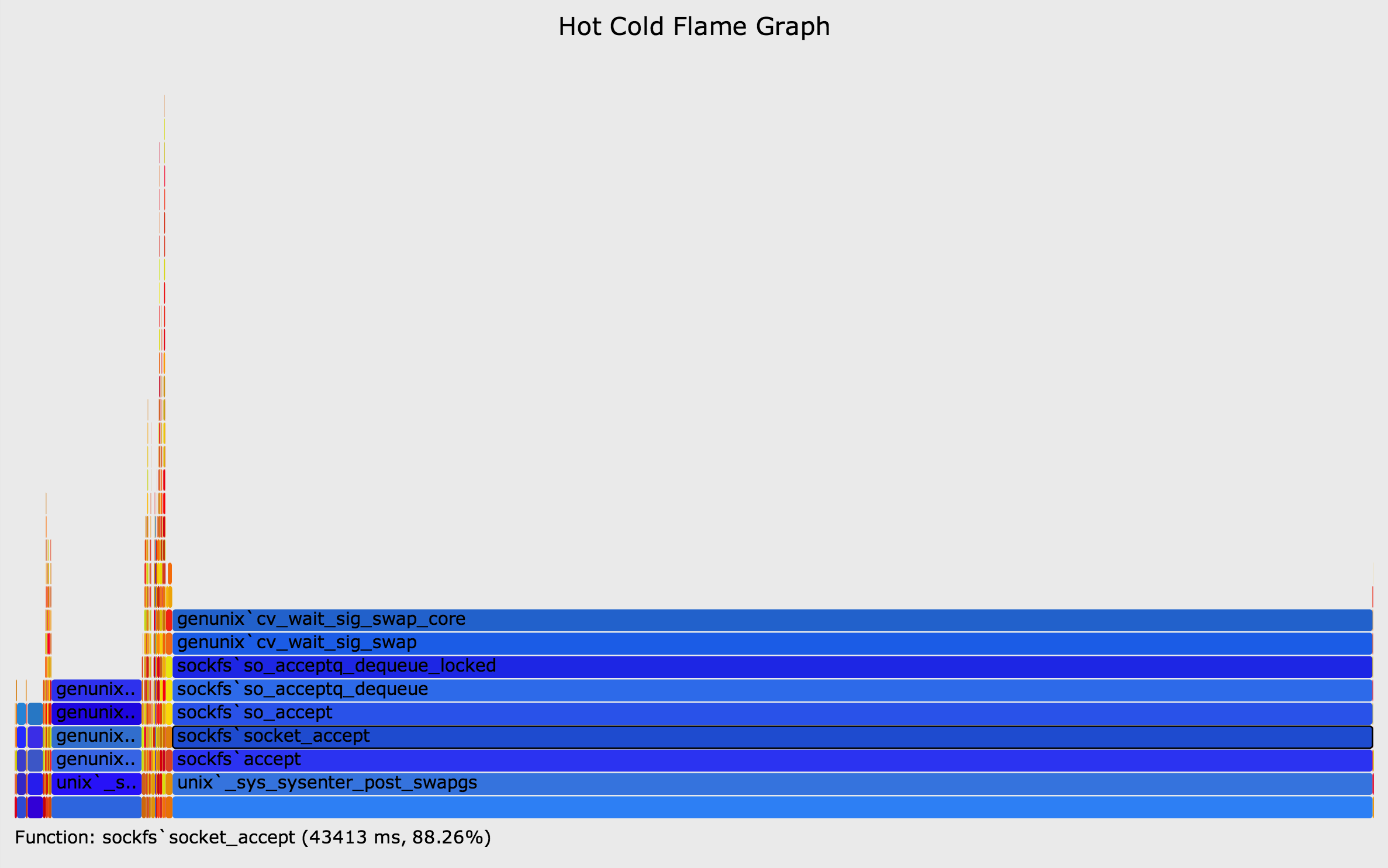
- Large off-CPU time: as times are summed, the off-CPU time from multiple sleeping threads usually dominates the flame graph, squeezing on-CPU time to a narrow range, making it difficult to read. See the image on the top right of this page for an example. It may be possible to address this with more interactivity: zoomable flame graphs, so that the narrow on-CPU regions can be widened.
- Overheads: CPU profiling can be performed with low overhead, by sampling activity at fixed intervals. Off-CPU profiling by tracing scheduler events can begin to suffer significant overhead for busy workloads. While the same is true for separate off-CPU flame graphs, should a hot/cold flame graph be generated in a case where a CPU flame graph would have been sufficient (ie, a CPU issue), then more overhead was paid than necessary.
The following sections show different possibilities for hot/cold flame graphs: separate, mixed, and integrated.
1. Separate
One approach to solve some of these difficulties is also the easiest: simply generate separate on- and off-CPU flame graphs and show them together:
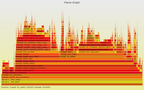
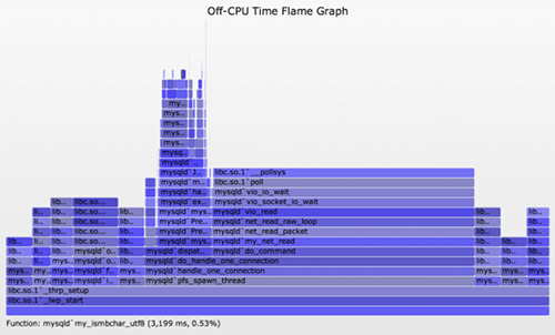
This solves the compressed on-CPU time problem, and also to some degree avoids confusion from mixing the types under one graph.
2. Mixed
The hot/cold flames can be shown together, scaled to the same x-axis. The following example shows a single kernel thread, with on- and off-CPU paths (SVG, PNG; sorry, this is an older version that lacks zoom):
I shared the code for generating this under the dev directory of FlameGraph tools. As mentioned under Difficulties, the relatively large amount of off-CPU time can squeeze the on-CPU time. Showing per-thread hot/cold flame graphs helps to a point.
3. Integrated
Vladimir Kirillov has included blocking calls in eflame, an Erlang Flame Graph profiler, by integrating the blocking data with the CPU profile, so that ancestry can be merged. The final blocking function is shown as blue on top of a warm stack. One of his examples:
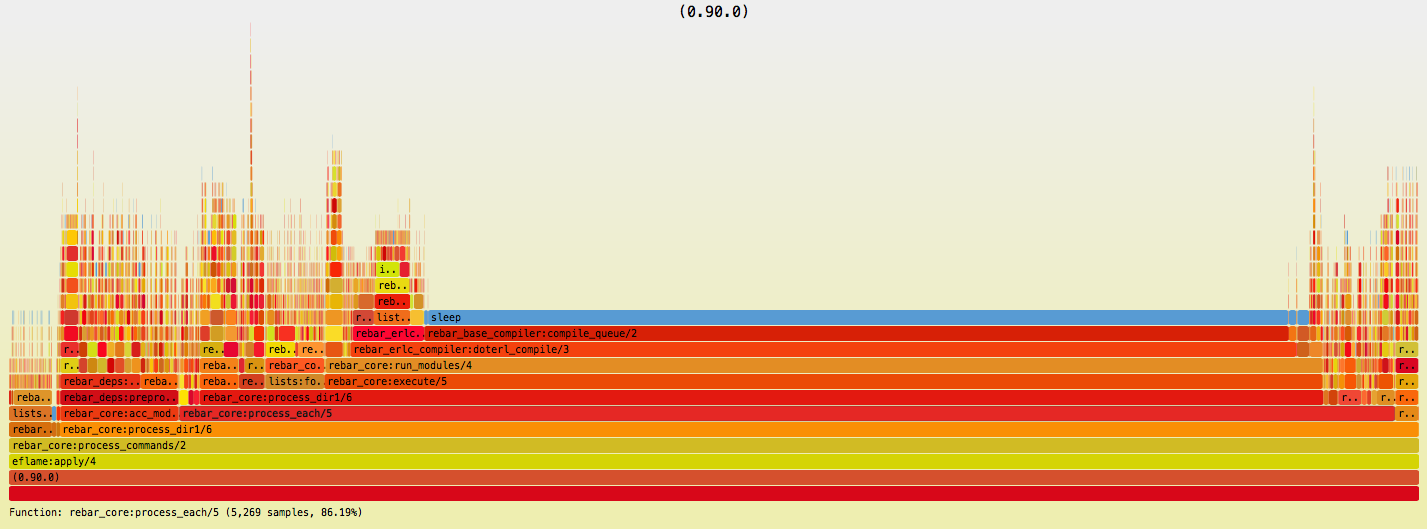
It looks effective to me, and keeps the ancestry stacks as merged as possible. Although, this does diminish the visual effect of the blue color for blocking. Perhaps this is still the best approach so far?
Links
Bruce Dawson also suggested this type of visualization while he was working with Xperf data; see the comment thread.
See the main Flame Graphs page for other types of flame graphs and links, and the flame graph software.