Latency Heat Maps
Response time – or latency – is crucial to understand in detail, but many common presentations of this metric hide important details and patterns. Latency heat maps are an effective way to reveal these details: showing distribution modes, outliers, and other details.
I often use tools that provide heat maps directly, but sometimes I have separate trace output that I'd like to convert into a heat map. To answer this need, I just wrote trace2heatmap.pl, which generates interactive SVGs.
I'll explain latency heat maps on this page by using disk I/O latency as an example.
Problem
As an example of disk I/O latency (aka storage I/O latency), I have a single disk system with a single process performing a sequential synchronous write workload. The storage device is a hard disk (rotational, magnetic). While this sounds like a very simple workload, the resulting latency profile is more interesting than you might expect.
Using iostat(1) to examine average latency (await) on Linux:
$ iostat -xz 1
[...skipping summary since boot...]
avg-cpu:  %user   %nice %system %iowait  %steal   %idle
           1.25    0.00    1.63   16.69    0.00   80.43

Device:         rrqm/s   wrqm/s     r/s     w/s    rkB/s    wkB/s avgrq-sz avgqu-sz   await r_await w_await  svctm  %util
xvdap1            0.00    20.00    0.00  269.00     0.00 34016.00   252.91     0.46    5.71    0.00    5.71   1.72  46.40

avg-cpu:  %user   %nice %system %iowait  %steal   %idle
           1.25    0.00    1.50   11.53    0.00   85.71

Device:         rrqm/s   wrqm/s     r/s     w/s    rkB/s    wkB/s avgrq-sz avgqu-sz   await r_await w_await  svctm  %util
xvdap1            0.00     0.00    0.00  207.00     0.00 26248.00   253.60     0.67    3.38    0.00    3.38   2.86  59.20

avg-cpu:  %user   %nice %system %iowait  %steal   %idle
           1.12    0.00    1.75   12.12    0.12   84.88

Device:         rrqm/s   wrqm/s     r/s     w/s    rkB/s    wkB/s avgrq-sz avgqu-sz   await r_await w_await  svctm  %util
xvdap1            0.00     0.00    0.00  181.00     0.00 22920.00   253.26     0.61    8.91    0.00    8.91   2.87  52.00
[...]
I could plot this average latency as a line graph, which varied between 3 and 9 ms in the above output. This is what most monitoring products show. But the average can be misleading. Since latency is so important for performance, I want to know exactly what is happening.
To understand latency in more detail, you can use my biosnoop tool from the bcc collection for Linux, which uses eBPF. I've written about it before, and I developed a version that uses perf for older Linux systems, called iosnoop in perf-tools. biosnoop instruments storage I/O events and prints a one line summary per event.
# /mnt/src/bcc/tools/biosnoop.py > out.biosnoop
^C
# more out.biosnoop
TIME(s)        COMM           PID    DISK    T  SECTOR    BYTES   LAT(ms)
0.000000000    odsync         32573  xvda1   W  16370688  131072     1.72
0.000546000    bash           2522   xvda1   R  4487576   4096       0.59
0.001765000    odsync         32573  xvda1   W  16370944  131072     1.66
0.003597000    odsync         32573  xvda1   W  16371200  131072     1.74
0.004685000    bash           2522   xvda1   R  4490816   4096       3.63
0.005397000    odsync         32573  xvda1   W  16371456  131072     1.72
0.006539000    bash           2522   xvda1   R  4490784   4096       0.66
0.007219000    odsync         32573  xvda1   W  16371712  131072     1.74
0.007333000    bash           2522   xvda1   R  4260224   4096       0.58
0.008363000    bash           2522   xvda1   R  266584    4096       0.93
0.009001000    odsync         32573  xvda1   W  16371968  131072     1.69
0.009376000    bash           2522   xvda1   R  5222944   4096       0.92
[...31,000 lines truncated...]
I/O latency is the "LAT(ms)" column. Individually, the I/O latency was usually less than 2 milliseconds. This is much lower than the average seen earlier, so something is amiss. The reason must be in this raw event dump, but it is thousands of lines long – too much to read.
Latency Histogram: With Outliers
The latency distribution can be examined as a histogram (using R, and a subset of the trace file):

This shows that the average has been dragged up by latency outliers: I/O with very high latency. Most of the I/O in the histogram was in a single column on the left.
This is a fairly common occurrence, and it's very useful to know when it has occurred. Those outliers may be individually causing problems, and can be easily be plucked from the trace file for further analysis. For example:
$ awk '$NF > 50' out.biosnoop
TIME(s)        COMM           PID    DISK    T  SECTOR    BYTES   LAT(ms)
0.375530000    odsync         32573  xvda1   W  16409344  131072    89.43
0.674971000    odsync         32573  xvda1   W  16439040  131072    82.59
2.759588000    supervise      1800   xvda1   W  13057936  4096     142.49
2.763500000    supervise      1800   xvda1   W  13434872  4096     146.10
2.796267000    odsync         32573  xvda1   W  16732672  131072   157.92
[...]
This quickly creates a list of I/O taking longer than 50 milliseconds (I used $NF in the awk program: a short-cut that matches the last field).
Latency Histogram: Zoomed
Zooming in, by generating a histogram of the 0 - 2 ms range:

The I/O distribution is bi-modal. This also commonly occurs for latency or response time in different subsystems. Eg, the application has a "fast path" and a "slow path", or a resource has cache hits vs cache misses, etc.
But there is still more hidden here. The average latency reported by iostat hinted that there was per-second variance. This histogram is reporting the entire two minutes of iosnoop output.
Latency Histogram: Animation
I rendered the iosnoop output as per-second histograms, and generated the following animation (a subset of the frames):

Not only is this bi-modal, but the modes move over time. This had been obscured by rendering all data as a single histogram.
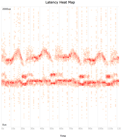
Heat Map
Using trace2heatmap.pl (github) to generate a heat map from the iosnoop output.
Mouse-over for details, and compare to the animation above. If this embedded SVG isn't working in your browser, try this SVG or PNG.
The command used was:
$ awk 'NR > 1 { print $1, 1000 * $NF }' out.biosnoop | \
    ./trace2heatmap.pl --unitstime=s --unitslabel=us --maxlat=2000 > out.biosnoop.svg
This feeds the "TIME(s)" (end time) and "LAT(ms)" (latency) columns to trace2heatmap.pl. It also converts the latency column to microseconds (x 1000), and sets the upper limit of the heat map to 2000 microseconds (--maxlat).
Without "--grid", the grid lines are not drawn (making it more Tufte-friendly); see the example.
trace2heatmap.pl gets the job done, but it's probably a bit buggy – I spent three hours writing it (and more than three hours writing this page about it!), really for just the trace files I don't already have heat maps for.
Heat Maps Explained
It may already be obvious how these work. Each frame of the histogram animation becomes a column in a latency heat map, with the histogram bar height represented as a color:

You can also see my summary for how heat maps work, and my longer article about them: "Visualizing System Latency" (ACMQ, CACM).
Scatter Plot
A heat map is similar to a scatter plot, however, placing points in buckets (the rectangles) rather than showing them individually. Because there is a finite number of buckets in a heatmap, the storage cost is fixed, unlike a scatter plot which must store x and y coordinates for every data point. This can make heat maps suitable for visualizing millions of data elements. Detail may also be seen beyond the point where a scatter plot becomes too cluttered.
Linux: ftrace, perf, eBPF
For the example problem above, I instrumented latencies on Linux using eBPF. There are a number of tracers in Linux that can generate per-event latency data, suitable for turning into latency heat maps. The Linux built in tracers are ftrace, perf (aka perf_events), and eBPF. There are several add-on tracers as well, and I used the bcc add-on for eBPF above. You may also use per-event latency data generated by application code.
Other Operating Systems
It should not be hard to get latency details from other modern operating systems using tracing tools. Applications can also be modified to generate per-event latency logs.
FreeBSD: DTrace
On FreeBSD systems, DTrace can be used to generate per-event latency data. For example, disk I/O latency events can be printed and processed using my DTrace-based iosnoop tool in a similar way:
# iosnoop -Dots > out.iosnoop
^C
# more out.iosnoop
STIME(us)   TIME(us)    DELTA(us) DTIME(us) UID   PID D    BLOCK   SIZE      COMM PATHNAME
9339835115  9339835827  712       730       100 23885 W 253757952 131072    odsync <none>
9339835157  9339836008  850       180       100 23885 W 252168272   4096    odsync <none>
9339926948  9339927672  723       731       100 23885 W 251696640 131072    odsync <none>
[...15,000 lines truncated...]
Examining outliers:
# awk '$3 > 50000' out.iosnoop_marssync01
STIME(us)   TIME(us)    DELTA(us) DTIME(us) UID   PID D    BLOCK   SIZE      COMM PATHNAME
9343218579  9343276502  57922     57398      0      0 W 142876112  4096      sched <none>
9343218595  9343276605  58010     103        0      0 W 195581749  5632      sched <none>
9343278072  9343328860  50788     50091      0      0 W 195581794  4608      sched <none>
[...]
Creating the heatmap:
$ awk '{ print $2, $3 }' out.iosnoop | ./trace2heatmap.pl --unitstime=us \
    --unitslabel=us --maxlat=2000 --grid > heatmap.svg
This feeds the "TIME(us)" (end time) and "DELTA(us)" (latency) columns to trace2heatmap.pl.
The histogram images and heat map shown in this page were actually generated from DTrace data on a Solaris system. I've since updated this page to cover Linux and FreeBSD.
Production Use
If you want to add heat maps to your monitoring product, that would be great! However, note that tracing per-event latency can be expensive to perform, and you will need to spend time understanding available tracers and how to use them efficiently. Tools like eBPF on Linux, or DTrace on Solaris/BSD, can minimize the overheads as much as possible using per-CPU buffers and asynchronous kernel-user transfers. Even more effective: they can also do a partial histogram summary in kernel context, and export that instead of every event. On older Linux, you can create perf_events heat maps, although without eBPF it requires passing events to user space for post processing, which is more expensive. Other tools (eg, strace, tcpdump) are also expected to have higher overhead as they also pass all events to user space. This can cause problems for production use: you want to understand the overhead before tracing events.
It is possible to record heat map data 24x7 at a one-second granularity. I worked on Analytics for the Sun Storage Appliance (launched in 2008), which used DTrace to instrument and summarize data as in-kernel histograms which it passed to user space, instead of passing every event. This reduced the data transfer by a large factor (eg, 1000x), improving efficiency. The in-kernel histogram also used many buckets (eg, 200), which were then resampled (downsampled) by the monitoring application to the final desired resolution. This approach worked, and the overhead for continuously recording I/O heat map data was negligible. I would recommend future analysis products do this approach using eBPF on Linux.
Background
See the background description on may heat maps main page, which describes the origin of latency heat maps and links to other heat map types.
Thanks to Deirdré Straughan for helping editing this page.